

Featured Post
The Psychology of Color in Interior Design: Crafting Spaces That Inspire
Overview
Colors do more than decorate a room—they influence how we feel, think, and behave. The Psychology of Color in Interior Design reveals how hues can create calm, boost energy, or make small spaces feel larger. This article explores color’s emotional impact, practical applications, and expert tips for indoor and outdoor spaces.
How Colors Shape Your Mood
Colors have a profound effect on our emotions. Red sparks energy and passion but can feel overwhelming in large doses. Blue promotes calmness, making it ideal for bedrooms. Yellow radiates warmth and creativity, perfect for kitchens or creative studios. According to a study by the University of British Columbia, blue environments enhance focus, while red can increase heart rates, signaling alertness.
Think about your morning coffee in a bright yellow kitchen—it feels lively, doesn’t it? But that same yellow in a bedroom might keep you awake. Understanding how colors shape your mood helps you choose hues that align with a room’s purpose. For example, I once painted my home office a soft green, and it instantly felt more serene, helping me focus during long workdays.
When picking colors, consider the room’s function. A living room might benefit from warm tones like coral or beige to foster connection. A study nook could use cool blues to aid concentration. Always test paint samples in natural light—colors shift throughout the day, and you want a shade that feels right morning to night.
Color Psychology: Using Light Colors in Small Spaces
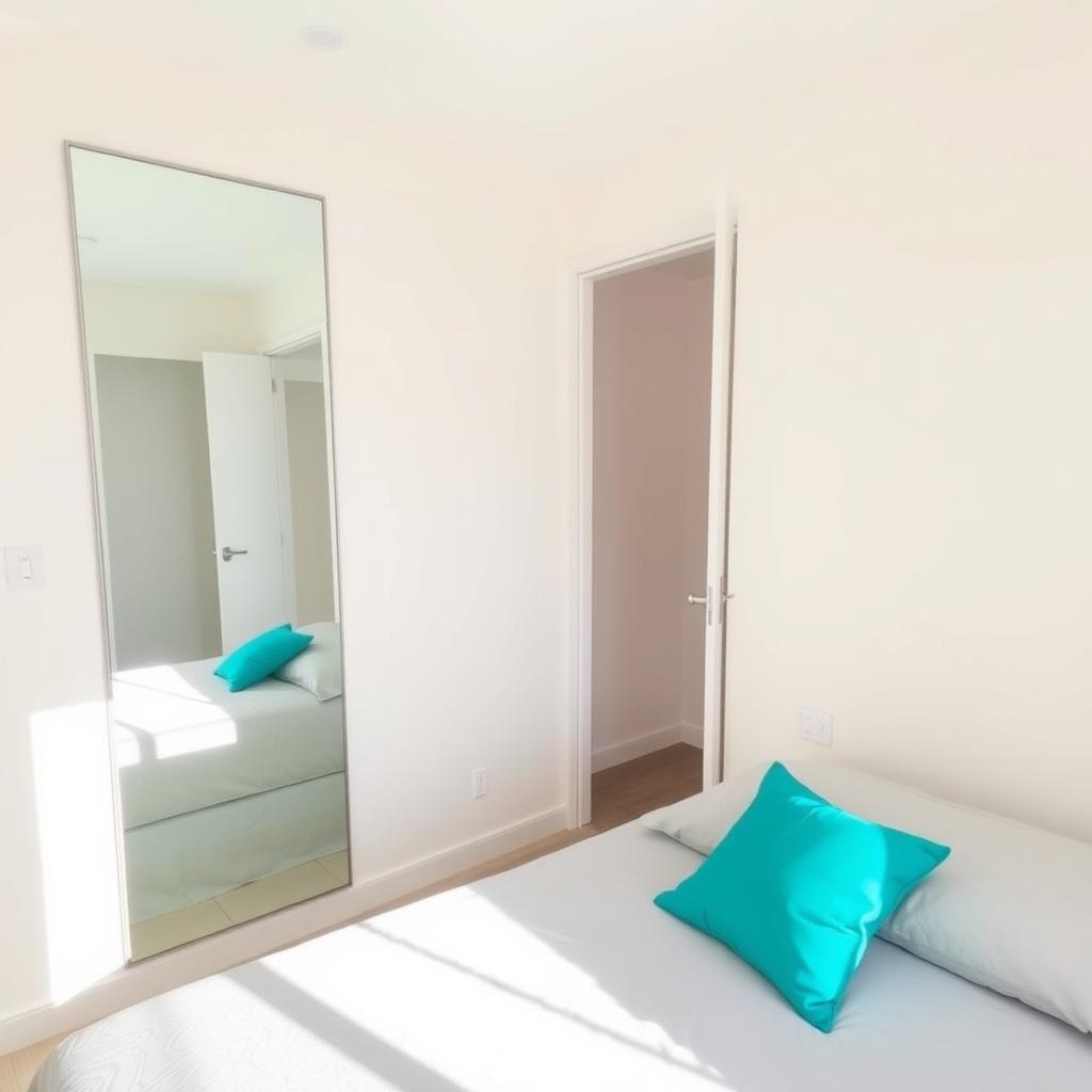
Small rooms can feel cramped, but light colors work magic. Color Psychology: Using Light Colors in Small Spaces shows that soft whites, pale blues, and light grays reflect light, making rooms feel airy and spacious. A report from the National Association of Home Builders notes that light-colored walls can make a room appear up to 20% larger.
In my old apartment, a tiny bedroom felt like a closet until I painted it a creamy white. Paired with a large mirror, the space doubled in perceived size. Light colors don’t just trick the eye—they lift your mood by reducing feelings of confinement. Add glossy finishes or metallic accents to amplify this effect.
For small spaces, stick to a monochromatic palette with varying shades of one color. For example, pair light gray walls with charcoal furniture and white trim. This creates depth without overwhelming the space. Avoid dark colors on all walls—they absorb light and shrink the room. If you crave bold hues, use them sparingly in accents like cushions or rugs.
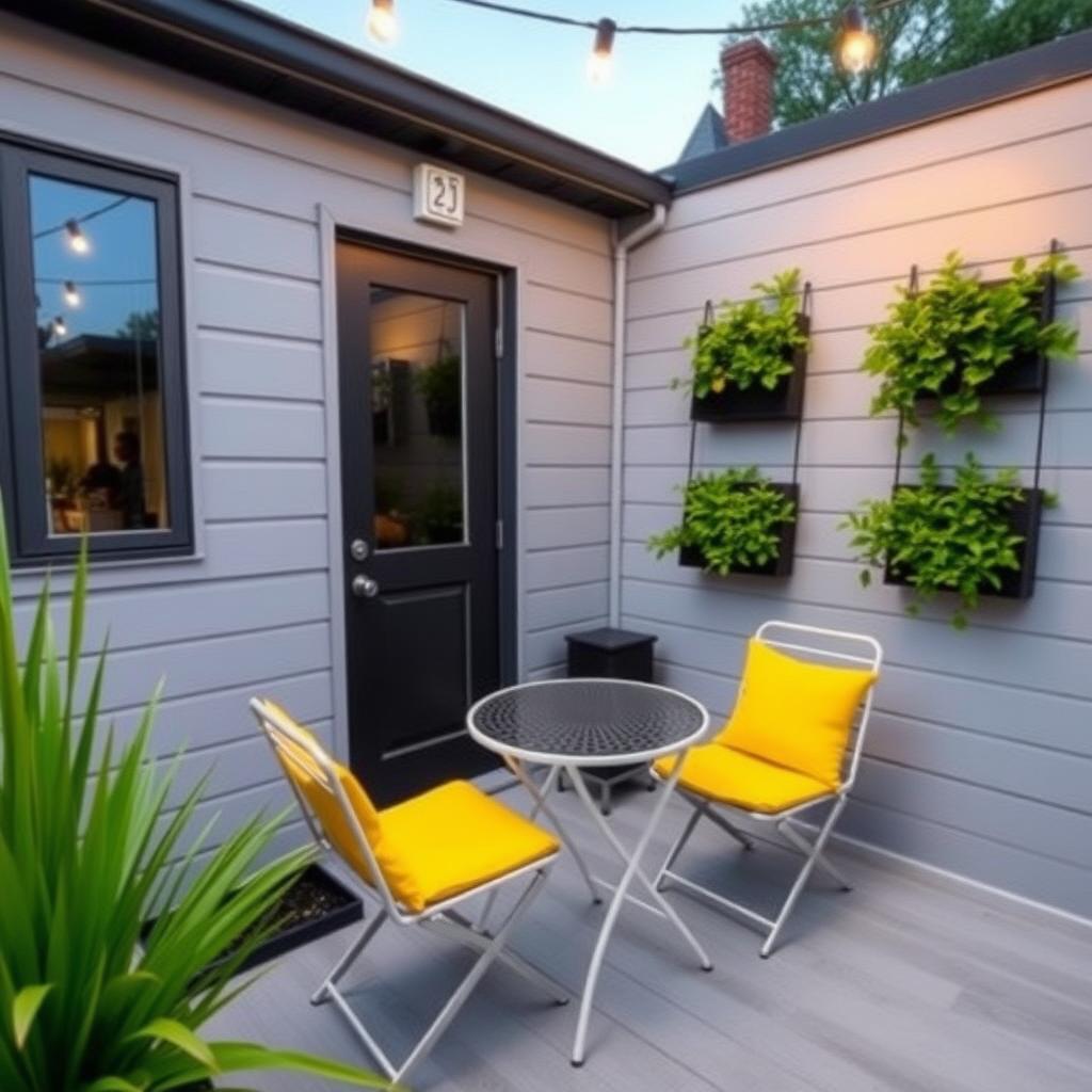
Top 5 Ways to Maximize Small Outdoor Spaces
Outdoor areas, like patios or balconies, benefit from color psychology too. Here are the Top 5 Ways to Maximize Small Outdoor Spaces with color and design:
- Use Light Colors for Openness: Paint outdoor walls or fences in light shades like ivory or pale blue to make the area feel larger. These reflect sunlight, brightening the space.
- Incorporate Multifunctional Patio Furniture Pieces: Choose items like storage benches or foldable tables. I once used a bench that doubled as a planter—it saved space and added charm.
- Add Pops of Color: Bright cushions or rugs in vibrant hues like orange or turquoise draw the eye upward, creating a sense of height.
- Use Vertical Elements: Hang planters or string lights to maximize vertical space. Green plants paired with neutral tones feel calming and expansive.
- Mirror Magic: Place weather-resistant mirrors to reflect light and scenery, doubling the perceived size of your patio.
These strategies, backed by design principles from the American Society of Landscape Architects, make small outdoor spaces feel inviting and functional.
When designing my balcony, I used a light gray deck stain and added a foldable bistro set. A few bright yellow cushions brought energy without cluttering the space. The result? A cozy nook for morning tea that felt much larger than its 50 square feet.
Choosing Colors for Emotional Impact
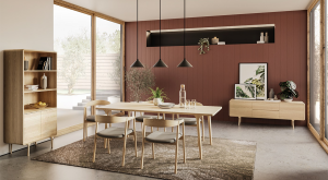
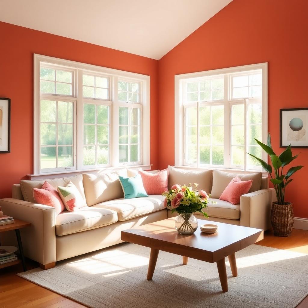
Every color tells a story. Green evokes nature and renewal, ideal for bathrooms or reading nooks. Purple sparks creativity but can feel heavy in large doses—use it for accent walls. Neutral tones like beige or taupe offer flexibility, letting furniture or art pop.
When I redecorated my living room, I chose a soft blue accent wall behind my TV. It calmed the space, making movie nights feel more relaxing. The key is balance—too much of one color can overwhelm. Use the 60-30-10 rule: 60% main color, 30% secondary, and 10% accent. This creates harmony while letting each hue shine.
Lighting matters too. Warm lighting enhances reds and yellows, while cool lighting complements blues and greens. Test your colors under your room’s lighting conditions. A study from the Lighting Research Center shows that lighting can alter color perception by up to 15%, so always check before committing.
Practical Tips for Applying Color Psychology
Here’s how to put color psychology into action:
| Room Type | Recommended Colors | Mood Impact |
|---|---|---|
| Bedroom | Blue, Lavender | Calming, Restful |
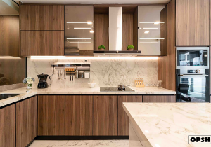
| Kitchen | Yellow, White | Energetic, Clean |
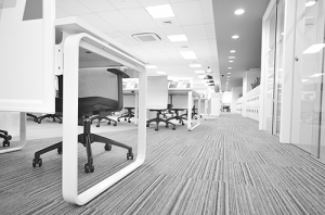
| Office | Green, Gray | Focused, Balanced |
| Patio | Light Blue, Ivory | Open, Inviting |
- Start Small: If you’re nervous, try an accent wall or colorful decor before painting everything.
- Consider Texture: Matte finishes feel cozy; glossy ones add energy.
- Mix Warm and Cool Tones: Pair warm furniture with cool walls for balance.
- Think Long-Term: Choose colors you’ll love for years, not trendy shades that fade fast.
Summary
The Psychology of Color in Interior Design is about more than aesthetics—it’s about creating spaces that feel right. Light colors expand small rooms, vibrant hues energize outdoor areas, and thoughtful furniture choices maximize function. By understanding how colors shape your mood, you can design homes and patios that inspire joy and comfort. Experiment, test, and let your space reflect you.